5 Jaw-Dropping Renovation Before and After Pics You Have to See to Believe
I think we can all agree that renovation before and after pictures are one of the best forms of *instant* gratification. But as satisfying as they can be, renovation before and after transformations actually erase all the hard work that goes into home renovations.
I’m talking months of meetings, contract reviews, budget reallocations, room designs, and countless trips to our second home (Home Depot). Not to mention the sleepless nights spent worrying about the renovation budget, timeline, and the (*very* scary but *very* real) potential of losing money on our investment.
The truth is, home renovation is not for the faint of heart.
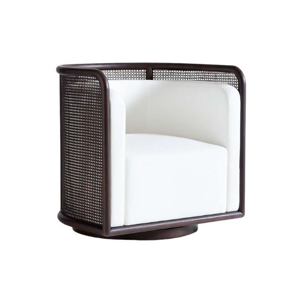
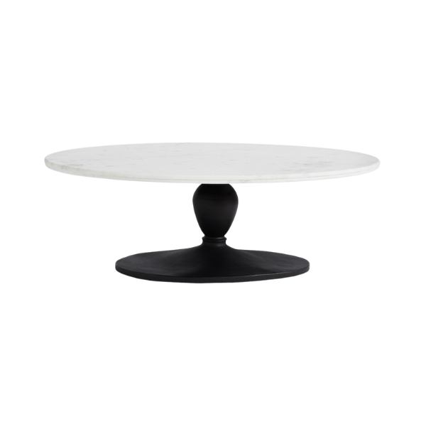
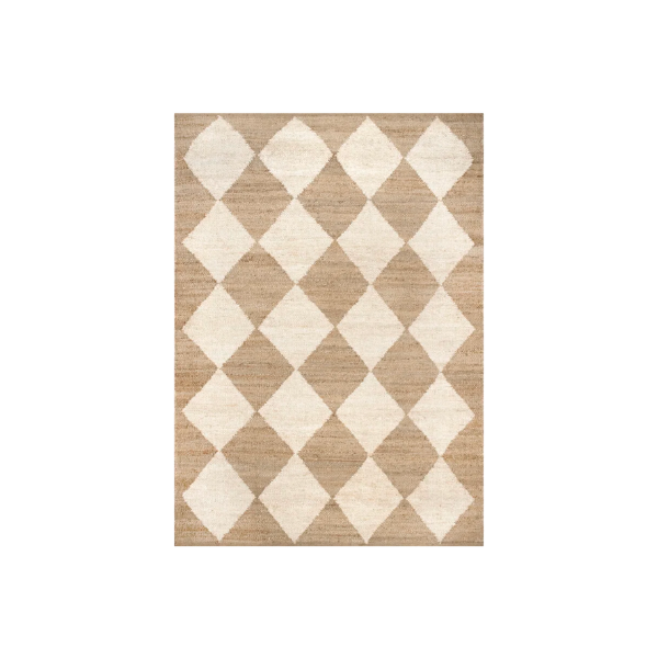
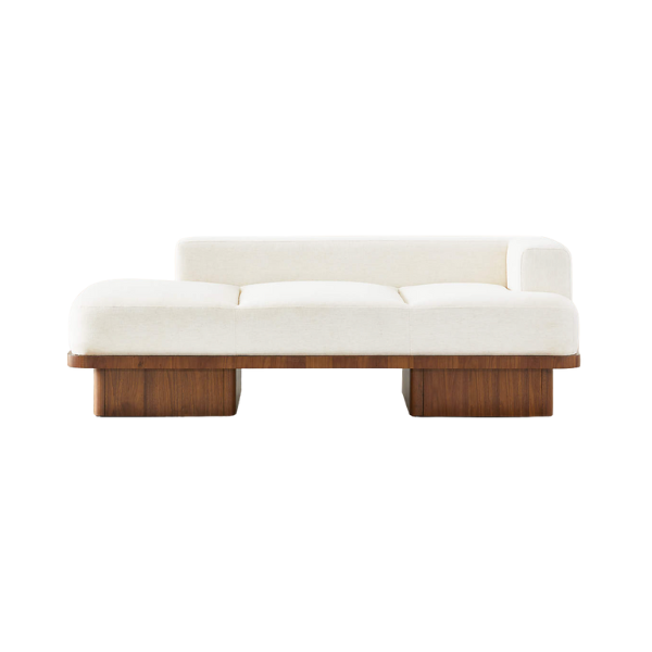
Shop The Room
HGTV shows like “Fixer Upper” and “Property Brothers” make house transformations look fun and exciting. But what they’re really doing is bypassing the day-to-day stress and, instead, focusing on the shocking transformations.
They celebrate every upgrade, from the open floorplan to the cabinet hardware, and inspire their renovation-loving audience to see beyond what’s in front of them.
So, let’s focus on the best part of home renovation projects: the potential. These are our TOP 5 renovation before and after transformations that will actually make your jaw drop. From an all-pink bathroom to a rainbow dining room…we’ve transformed some pretty crazy spaces.
You need to see it to believe it.
Let’s take a peek at these 5 insanely good room makeovers, plus some behind-the-scenes footage!
1. The Rainbow Dining Room
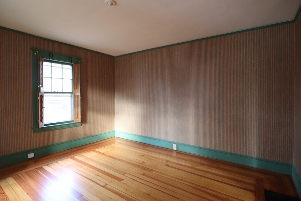
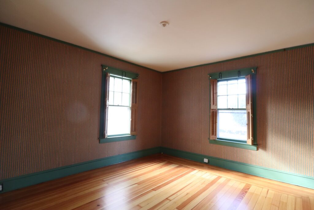
Truthfully, I have never seen green millwork, purple vent covers, and orange-striped wallpaper in one room…until this house. And boy, was it an experience.
Check out the “before” version below, and click the arrow on the right to reveal the epic transformation.
Shop all the products in our Dining Room here!
Don’t get me wrong, I love a pop of color. But the combination of all these outdated design elements in 1 room was too much, especially for resale.
Color can be pretty subjective. One home buyer might love the color red, while another buyer can’t stand to look at it. So if you’re renovating a house to sell, it’s better to play it safe with the color palette and take risks with the execution.
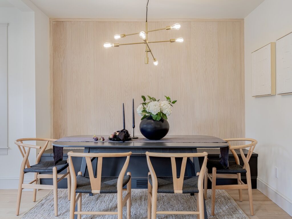
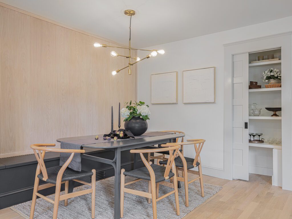
To attract a larger pool of buyers, we said goodbye to the greens, purples, and oranges and hello to our always-reliable neutrals.
We used pole wrap on the wall to create a textured focal point and contrasted the warm wood tones with one of our favorite black paint colors, Wrought Iron, by Benjamin Moore.
The room is actually really small. So, my daughter and I designed a built-in storage bench to span the entire width of the room in order to maximize every inch.
This dining room was the first thing buyers saw when they walked in the door, and it really made a statement! Honestly, this space turned out better than I could’ve ever imagined.
2. The Cherry Wood Kitchen
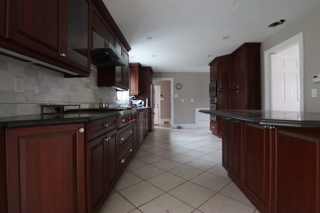
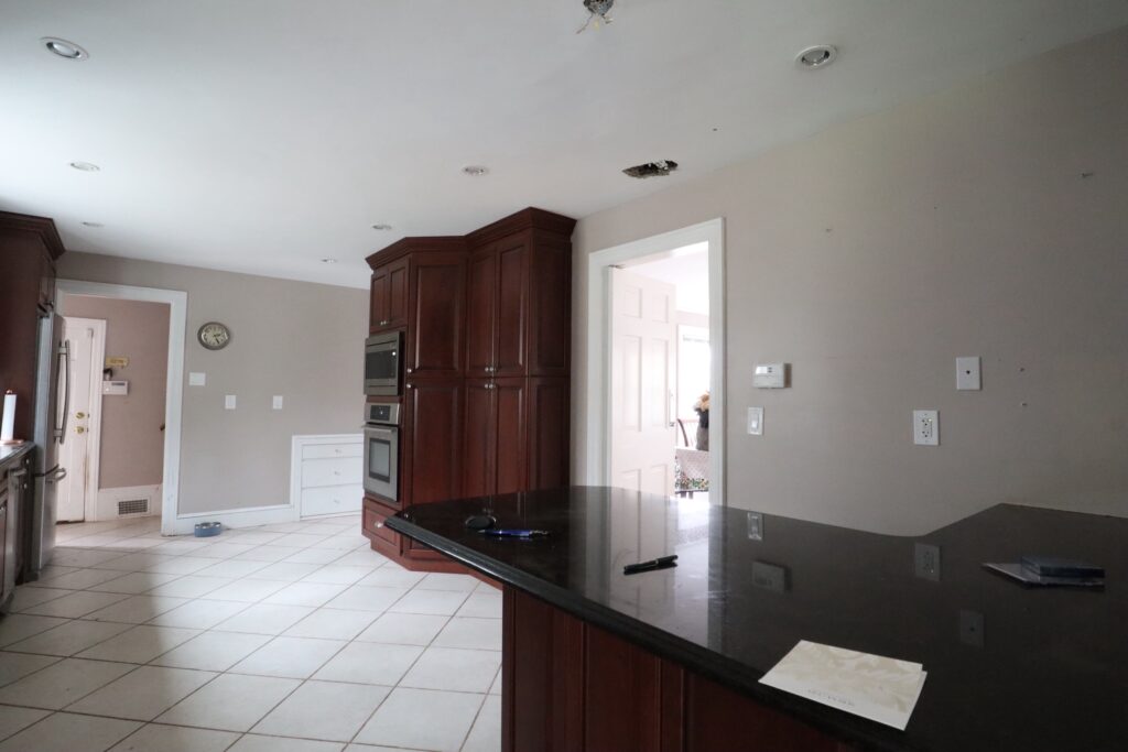
I’d be lying if I said I didn’t like the “before” version of this kitchen. The marble subway backsplash, chrome hardware, custom wood cabinets, and granite countertops were all high-quality finishes that served our family for years. But the realty is…the kitchen was outdated.
Gone are the days of cherry wood cabinets—for now, at least. When I selected these cherry shaker cabinets 15+ years ago, they were all the rage. But design trends evolved with the changing times, and it was time for our kitchen to catch up.
Our goal was to improve the flow of the kitchen, modernize the finishes, and add brightness to this dull room.
Check out this behind-the-scenes look at our epic kitchen renovation!
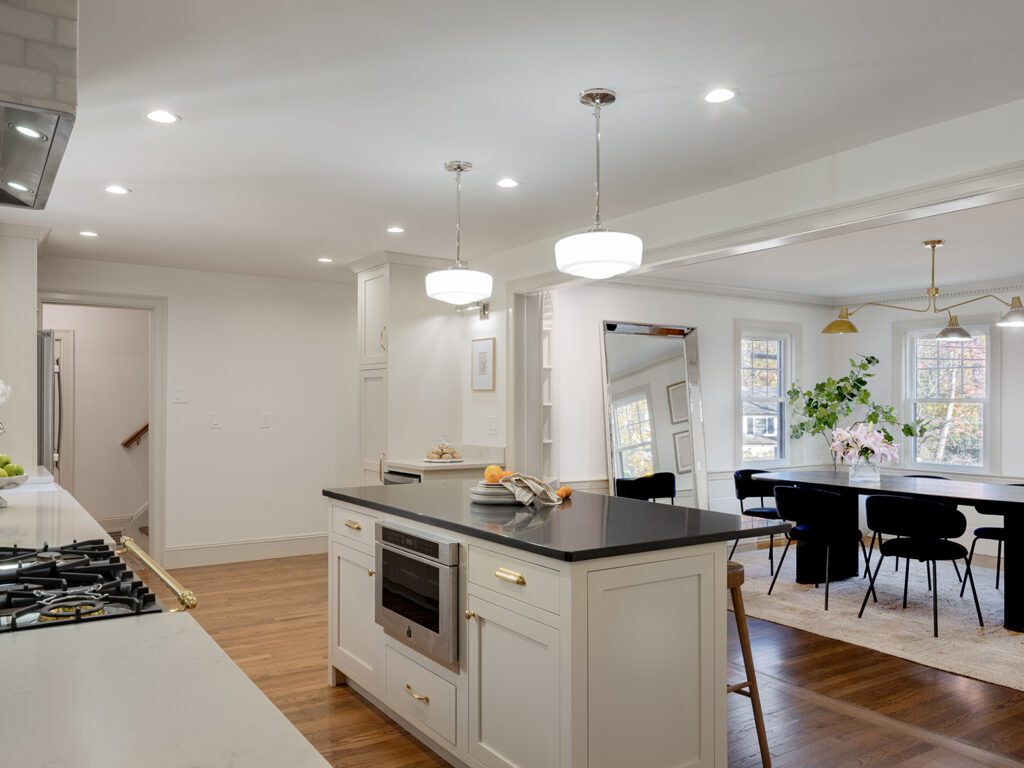
Our team removed everything and started from scratch. We kept the existing layout but removed the wall between the kitchen and the dining room to open up the space.
Pro tip: maintaining the floor plan allows you to preserve the existing utility lines, which saves time and money during your renovation.
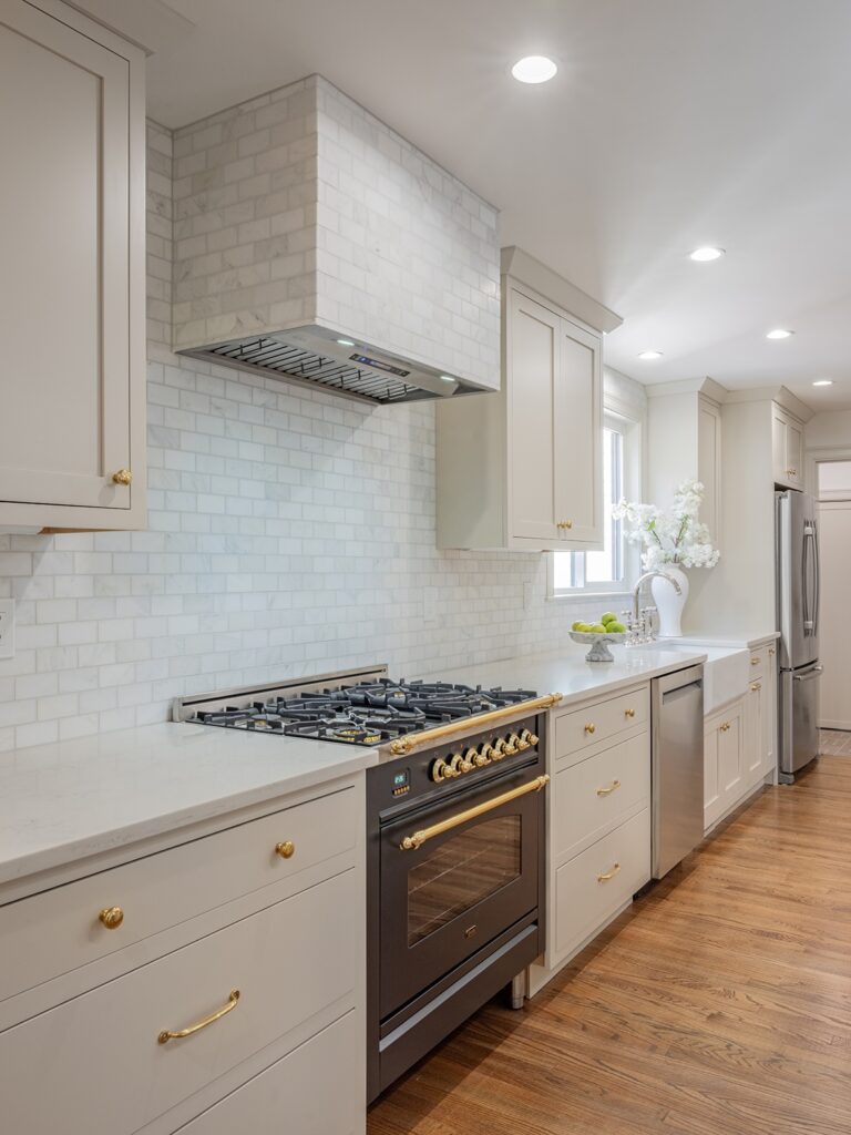
We gave our cherry wood cabinets a new home with another family and replaced them with custom inset shaker cabinets in Natural Tan by Sherwin Williams.
RELATED POST: Don’t Forget to Add This to Your Renovation Budget
We finished the kitchen with a white quartz perimeter, black granite island, polished brass Rejuvenation cabinet hardware, polished nickel electrical and plumbing fixtures, and the star of the show: a matte graphite Ilve range.
The central island improved the flow, the lighter finishes added some much-needed brightness, and the shiny hardware looked like jewelry in this room. Overall, the finished result was *chef’s kiss*!
3. The Tragically Pink Bathroom
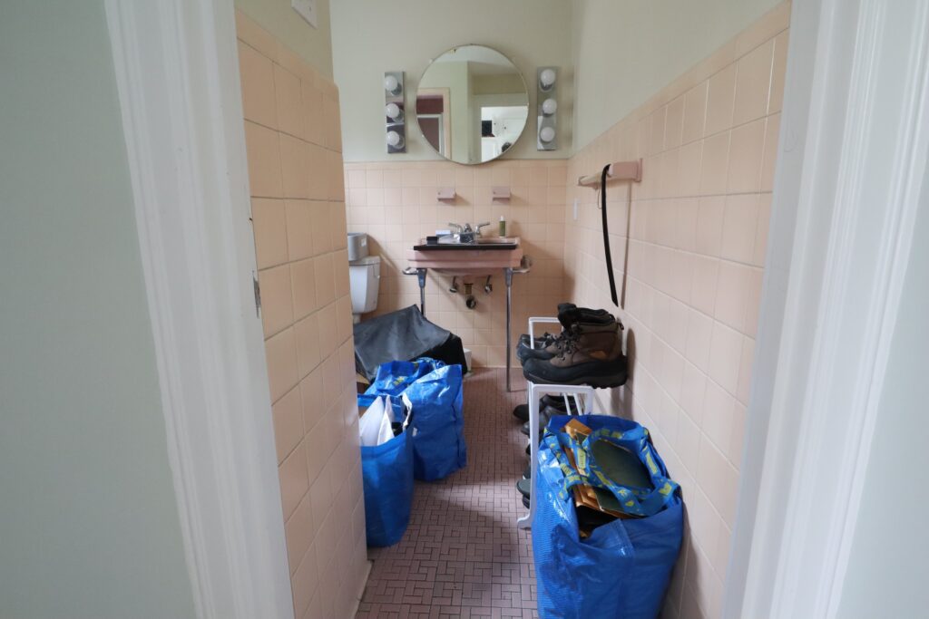
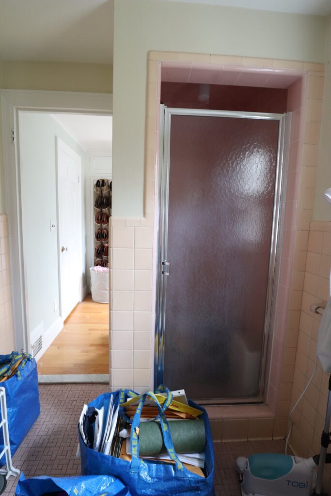
I love the color pink, but I’m not crazy about pink toilets. This retro primary bathroom and tiny walk-in closet were stuck in a different time zone, and it was time for a drastic makeover.
Our team started from scratch, demolishing every inch of the bathroom and closet until they had one big space. They even expanded the area by taking some square feet from the adjacent primary bedroom, which was bigger than it needed to be.
RELATED POST: Steal Our Guide to Hire the Best Home Improvement Contractors
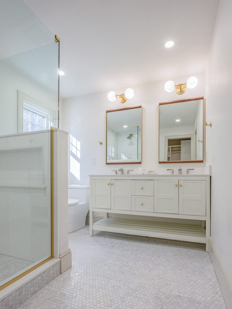
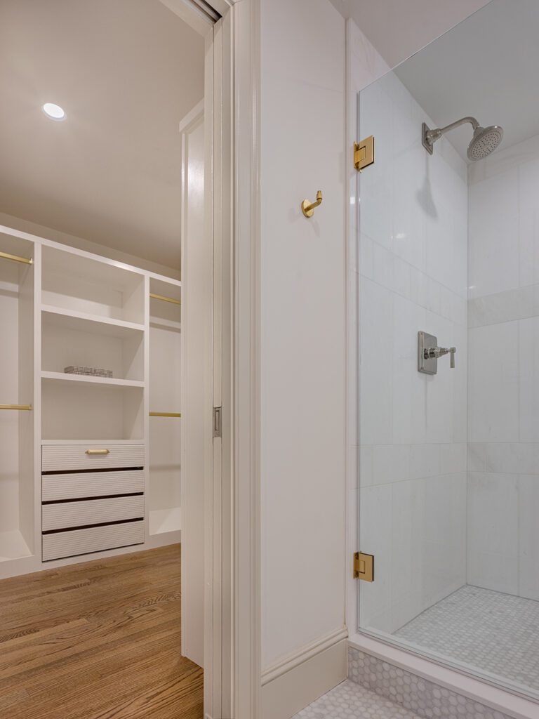
60% of the total space turned into the prettiest bathroom we’ve ever designed. The remaining 40% was dedicated to the primary walk-in closet, which featured a custom storage system (the dressing room of my dreams).
This house needed to shine in the luxury real estate market, so we went all out with the finishes. Marble everywhere! I’m talking marble floors, walls, and countertops in varying sizes and shapes. The shower walls featured a large 12″x24″ marble tile, contrasted with a small mosaic tile on the bathroom and shower floor.
When designing smaller bathrooms, try limiting any breaks on the floor to make the space appear bigger. We continued the bathroom floor tile into the shower, making the space feel expansive.
We mixed polished nickel and aged brass hardware throughout the bathroom and finished the space with a white double vanity to add even more brightness. This primary ensuite bathroom has lived *rent-free* in my mind for over a decade, so seeing it actually come to life was a dream come true.
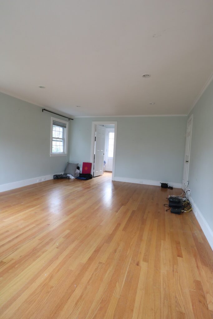
4. The Lackluster Primary Bedroom
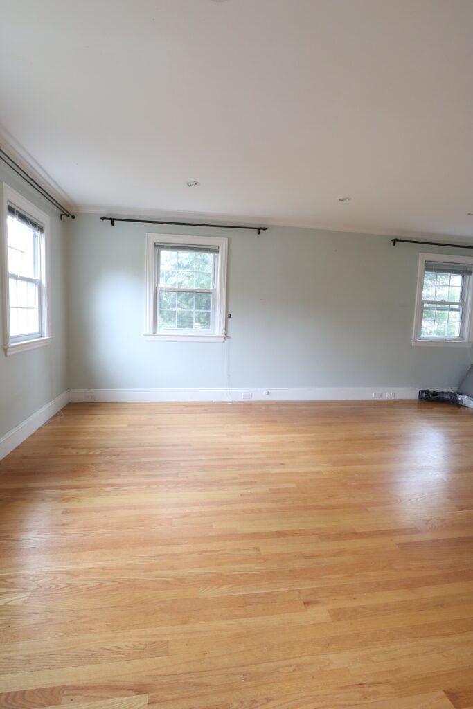
Moving on to the not-so-exciting primary bedroom. It’s not bad…it just needs a little *design magic*.
Confession time. I did something here that I hate doing: I asked my contractor to get rid of 2 windows in the bedroom—not 1 window, but 2!
Hear me out. The original space had 4 windows, which is more than enough natural light. I removed 1 window to steal some square footage for the ensuite bathroom and walk-in closet. The remaining window on the back wall would’ve been covered by the headboard, so it had to go, too.
In summary, we sacrificed some natural light for a more functional bathroom, walk-in closet, and bedroom design. So worth it, in my opinion.
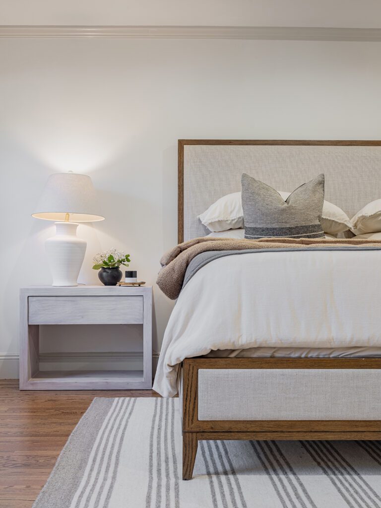
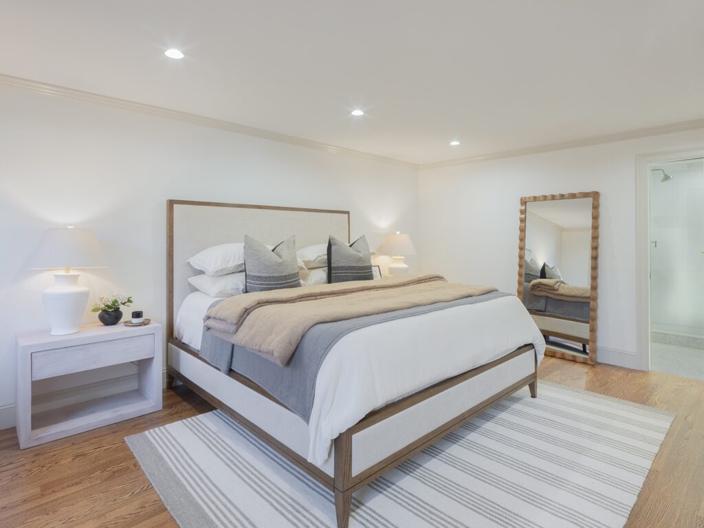
I introduced brightness back into the primary bedroom by adding recessed lighting throughout and painting the walls Dove White by Benjamin Moore. The combination of natural and artificial light reflecting off the white walls makes this space feel airy and bright!
Staging is so important in bedroom makeovers because there’s only so much you can do renovation-wise. My daughter used warm neutrals and large-scale pieces to fill the space, and I have to say, it looks like a hotel retreat. I can’t believe this outdated, pink primary suite transformed into this cozy, elevated oasis. It’s such a dream!
5. The Colonial Dining Room
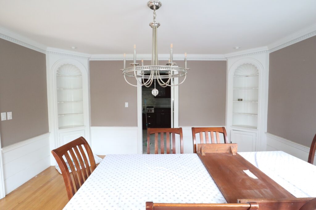
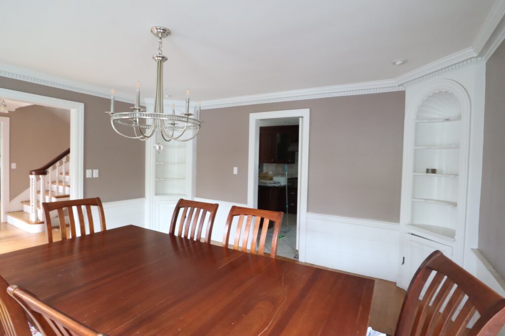
It’s time to give this outdated, colonial dining room a little facelift. The charming built-ins and millwork date back to 1932, so I was determined to preserve every original detail possible.
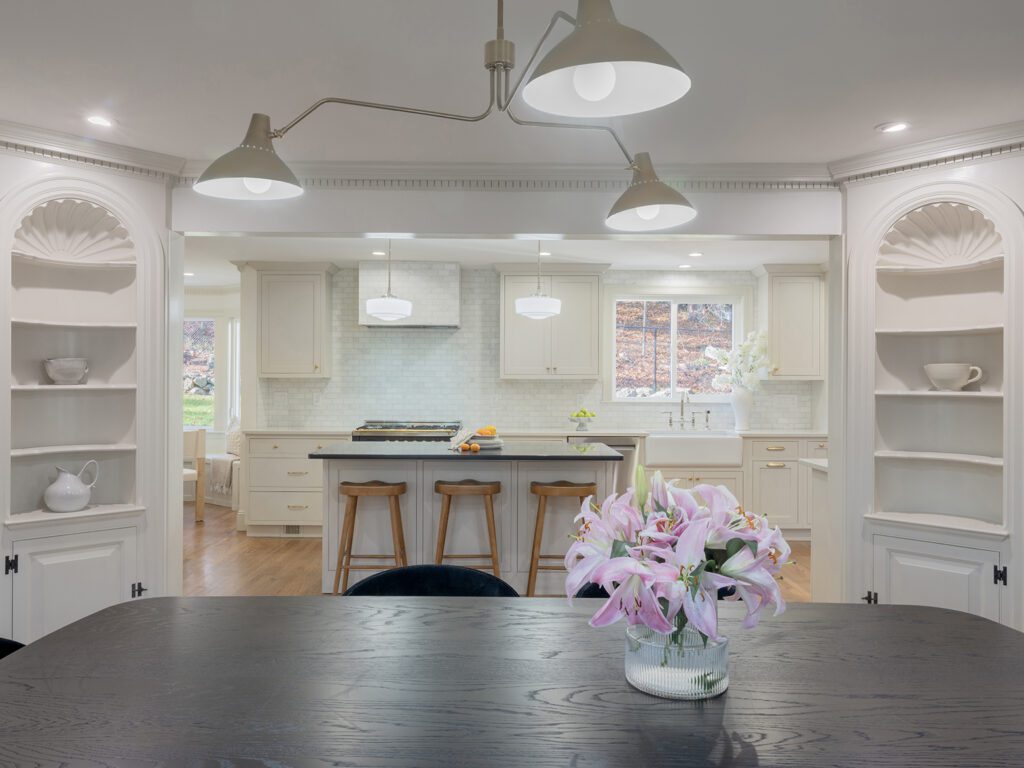
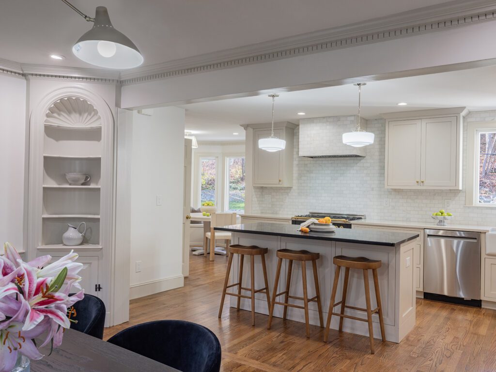
My contractor connected the dining room to the kitchen by removing the wall and adding a case opening between the curio cabinets, and wow—just wow—it made a huge difference! The spaces flow together, allowing family members in the kitchen to connect with others at the table. This is perfect for large families or entertaining bigger groups.
I used the same paint colors in both rooms to unify the spaces. My painters replaced the chocolate walls with Benjamin Moore’s White Dove and used Natural Cream on the millwork to help the original features stand out.
They even painted the ceiling the same color as the walls, except in a flat finish. This avoids breaking up the space with competing elements.
This kitchen and dining room combo is an entertainer’s dream. It celebrates the old while embracing the new. That’s really the common thread that connects all 5 of these renovation before and after transformations. The potential was already there; these spaces just needed a balance of restoration and renovation to enhance their beauty.
Now I’m dying to know…which renovation is your favorite? Let me know in the comments below!
And until next time, happy renovating!
This post is all about our best renovation before and after transformations.

